• Instagram
  • Facebook
  • Pinterest

Menu

Skip to content
  • Home
  • About
  • Gallery
  • Praise
  • Contact

Fall In Love…(Annie and Eric Part II)

10 / 16 / 085 / 28 / 15

My friends, Annie and Eric, find themselves continually enticed by what they’ve learned about having a destination wedding held in Mexico…That said, they are still considering staying local for an autumn wedding next year.

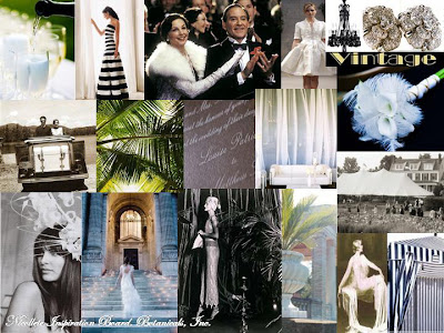
Wanting to give her a fair dose of inspiration – I created this board for her (below) to compare to the board I shared in my last entry.

While I absolutely adore traditional fall colors, I wanted to create a look that was a bit unexpected and special…worthy of the chic couple.

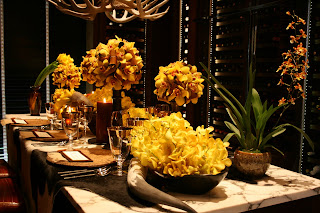
Taking a cue from warm tones of candlelight, I suggested a color palette of deep espresso, rich burnt oranges, softer apricot hues and champagne/ivory tones. Additionally complimenting those colors, I love the look of metallic gold and copper accents paired with bold peacock tints.

I told Annie that I saw copious amounts of candlelight, amber perimeter lighting and varied floral designs.

Autumn designs can look gorgeous with a more eclectic viewpoint – so incorporating varied woods, rusted urns and candle stands along with vintage metallic pieces would set the tone perfectly…Also, while we love the feel of a raw, rustic setting, we would also want this wedding to have an urban chic air about it – honouring the fantastic city we live in!

Whether they choose a Chicago autumn wedding or a tropical affair – Annie and Eric have plenty of style that will allow them to create the wedding of their dreams, perfectly suited for them.

Share

Sunny Inspiration…

10 / 10 / 085 / 28 / 15

One of my closet friends, Annie, was recently engaged to her best friend and boyfriend of over 10 years. We all knew they were made for each other, but no one knew when Eric would actually propose!
After surprising her with her dream ring while vacationing in Odessa Ukraine, Annie came home giddy with excitement but overwhelmed with details and dreams…Where to begin?
The couple has always talked about a destination wedding…one that would have a laid back feeling with an emphasis on celebration, close friends and family. However, the couple and the couples’ families are so comically popular that narrowing down the guest list might prove to be a daunting task, so they’d also like to also consider a larger, local wedding option.
Lucky for Annie – dreaming is all I do and I was happy to explore two different settings for their consideration. I created two inspiration boards for Annie and Eric – let’s see which peaks their interest more: 1. A destination setting VS 2. A local, rustic fall-themed wedding
The first board I created (below) was inspired by a tropical setting – as they are considering a few sites in Mexico. Annie and Eric are a savvy, modern couple with loads of style…a stereo-typical tropical themed wedding with vibrant pinks/greens/reds/blues is NOT going to make the cut!
I came up with a color palette of crisp white and green, accented by rich and unexpected navy tones. Although the wedding may take place in a unique destination – I still wanted it to read current, fashion-forward and chic. I told Annie that nothing needs to be over the top …let’s choose the right venue and let it speak for itself, requiring minimal enhancements.
I envisioned light gauzy fabrics blowing in the tropical breeze; long rectangular tables that lend a more intimate and festive feeling to the dinner; centerpieces composed of simple, monofloral creations of green and white flowers and contemporary accent details of navy blue.

Annie and Eric’s destination wedding may be a dream come true, or they may decide to stay local. After all – Chicago is one of the best cities in the world! Only time will tell what is best suited for such a perfectly matched couple…

Share

Fly by Design

10 / 3 / 085 / 28 / 15

A recent client wedding felt like a blur, as the whirlwind of details were pulled together in less than two months.

One of my most stylish brides to date hired me a mere month an a half before her late September wedding date. Luckily, however, it seemed as if we were a match made in heaven from the first day we sat together in our consultation room – chatting and dreaming about a worthy wedding design – to the minute she walked down the aisle, tearing with excited anticipation.

Lucky for me, this bride had done her research. As an interior designer for one of the hottest firms in Chicago, she knew it was important to properly vocalize her wishes for her wedding design. She had scoured countless glossy wedding, fashion and design magazines for inspiration. She had also taken inspiration from her unique and charming venue, The Murphy Auditorium, and from one of her favorite designers, Ralph Lauren, famous for a casual sophistication like no other.

The bride envisioned a wedding that oozed richness, specifically achieved through her chosen color palette of deep purples and blues enhanced with antiqued silver and pewter accents – surrounded by the rich wood-paneled walls of the room. She hoped for a wedding reminiscent of a men’s club circa 1920. She hoped for a wedding that may seem as if it were a vignette designed by Ralph Lauren, himself, for their fantastic Michigan Avenue store.

The ceremony was lit merely by candlelight. A custom aisle runner of rich navy spilled into the pleated curtains erected to mask the bands equipment. The aisle was bordered by a collection of varied glass vases, brimming with crystal clear water and topped with floating disk votive candles – a pathway of illumination leading the bride to her groom – all placed atop a solid border of feathery white rose petals. Creating the dramatic framed focal point for the couple was our vintage wrought-iron geometric arch, laden with rich and unruly foliages including magnolia, cotinus and camellia, bursting with bundles of white local hydrangea and open champagne colored roses, finally finished with the unexpected addition of black grapes and hanging mason jar votive candles.

The reception centerpieces were designed low to the table, allowing the evening to feel like an intimate candlelit dinner party. I considered the whole tablescape when creating the brides reception design. Vintage inspired silver-footed compote bowls overflowed with bountiful creations of Dutch blue hydrangea, purple lisianthus and garden stock, camellia foliage and velvety dusty miller. We chose chairs only found at Tablescapes Rentals that feature a champagne colored finish – a warm accent to the silver tones used on the table. Exquisite solid silver chargers were topped with a folded navy napkin framing the dinner menu and a charming sprig of seasonal privet berries. The elegant shape of the Murano stemware oozed elegance, as the table was lit with an abundance of candlelight.

The cake was simple and elegant. We created a petite hand tied bouquet of rich purple lisianthus and anemones accented with textural privet berries that simply rested atop the highest tier. The stems of this tiny nosegay were bound in navy Swiss double-faced silk ribbons left long to tumble down the tiers, for a graphic and graceful contrast against the classic ivory dressed cake.

Although the planning flew by in a matter of weeks, the details and the design could have fooled anyone, masked as years of careful planning because of the passion and inspiration I felt to create a wedding fit for one of the most stylishly savvy brides I’ve had the pleasure of working with.

Share

Autumn in Awe

9 / 13 / 085 / 28 / 15

A favorite client of mine, Alison, came to me (along with with my favorite planner friend Lisa Gia Bascomb of Parties Etc.) to help her design their November wedding last year. She wanted their day to have a classic, warm feeling – but did not want it to look expected nor stereotypical. Their beautiful wedding is now featured in the current national issue of The Knot.

Both the ceremony and the reception were held at one of our favorite venues (perfectly suited for a fall wedding), Cafe Brauer. The ceremony took place under a worn, wrought-iron chuppah, a canopy created from billowing rich chocolate taffeta chosen to compliment the table linens. The front of the chuppah was designed with a rustic collection of natural grapevines, white fluffy hydrangea, open garden roses and seasonal foliages.

Her color palette of chocolate brown and rich burnt orange was the perfect compliment to the raw brick setting.

With a guest count that allowed us to play with the size and shapes of the tables, we decided to seat guests at a collection of square tables and long rectangular tables.

The square tables hosted vintage rusted urns designed with textural collections of green Dutch hydrangea, orange ranunculus, tulips, roses, looped magnolia foliage (to showcase the velvety brown backing) and rope-like hanging amaranthus tumbling from the arrangement.

The rectangular tables hosted mono-floral collections of the saturated orange blooms to create a cleaner, more streamlined look running down the length of the table.

The Cub’s Dixieland Band surprised guests with serenade during the cocktail hour.

Here are a few more beautiful photos, shot by the amazing Pen Carlson duo.

Cafe Brauer has a wonderful skylight detailed with raw, exposed beams that are perfect for hanging things from. Here, to add to the warm, rustic feel, I suspended dozens of mason jar votive candles – twinkling above guests as they danced.

Alison’s bouquet was designed with out-of-season blooms including lilac, parrot tulips, lisianthus and ranunculus to name a few. I wrapped her bouquet with textural swiss silk ribbons, secured by her grandmothers vintage brooch.

Below is one of my favorite shots…so artful.

Her chilly November wedding left guests in awe of her Martha-worthy personlized details and perfectly special day.

Share

Rustic Charm in the Heart of Lincoln Park

8 / 30 / 085 / 28 / 15

My good friend (and industry ally – she’s one of the top sales consultants at Levy Catering!) Briana Merrill got married last fall. What does someone who works on client weddings every weekend decide for her wedding look? I was lucky enough to have been chosen to design their simple, elegant wedding that is now featured in the current issue of The Knot Chicago…

Briana and Nate got married in the gardens outside the Lincoln Park Zoo, on one of the most beautiful days of the early fall. Her charming wedding reception took place at the legendary Cafe Brauer, one of our favorite venues. The site has a warm, rustic, prairie-style feel to the space. Briana wanted to play up it’s key attributes, and therefore selected a color palette of creams, sages and chocolates.

I used a selection of varied containers – from richly stained wooden pieces (that complimented the rented chairs) to vintage rusted urns. We found lanterns that reflected the arts-and-crafts architecture of the venue and worked them into some of the designs.

During the ceremony, we had rustic shepards hooks hosting gorgeous, lush pomanders noting her aisle. The intention was to relocate all of the pomanders to the chairs of the bridal party table – but because she was blessed with such a gorgeous, sunny day – the pomanders were looking quite tired by the end of the ceremony. We created a pair of show-worthy ones to highlight the bride and grooms chairs from extra event flowers. Nothing like improvising!
Briana’s bridal bouquet was gorgeous and the perfect accessory to her chic, sophisticated dress. It was designed in classic whites, creams and champagne hues – but executed with flowers like lisianthus, veronica, dahlias, cymbidium orchid blossoms, ranunculus and hypericum berries to give the bouquet an elegant rounded silhouette, rich in texture.

Working with the oh-so-savvy wedding consultant, Katie Kozlowski of Dettagli, was a blast and we were able to execute a wedding for our friend Briana that lived up to her very high standards!

Additional notes: Thanks to the wonderful Kurt Gerber of Gerber and Scarpelli (who shot my wedding!) for the lovely images!

Share

With Style and Grace…

8 / 27 / 085 / 28 / 15

One of my absolute favorite wedding publications, Grace Ormonde Wedding Style, approached me to do another photo shoot for their gorgeous, glossy pages. Alongside my partner in crime, Jesse, we created a dreamy setting in the wine cellar of the Park Hyatt’s NOMI.

We wanted to create a scene that was lavish and opulent, yet rustic and warm. We wanted it to feel like a fancypants dinner party, set atop a clients’ kitchen island…an intimate group of best friends sipping their favorite vintage and indulging in fare fit for royalty.
Jesse and I created a chandelier from naturally shed antlers that dangled overhead. We used rawhides as the velvety accent linens, enhancing the naturally gorgeous marble tabletop. We selected an eclectic collection of vessels to host bundles of golden yellow and amber toned flowers and elements such as mokara and cymbidium orchids, yellow miniature calla lilies, sandy-backed magnolia foliage and pincushion proteas. Glistening gold-rimmed stemware and worn wooden charger plates created an interesting juxtaposition of textures and styles – all further enhanced by varied forms of flickering candlelight.

Thanks for the opportunity, Grace, as the only Chicago-featured design firm – I’m honoured to be a part of such style!

Share

Stand By Me…

8 / 23 / 085 / 28 / 15

What’s a bride to do when her favorite ladies live out of town when she’s all ready to ask them to be a part of her wedding party? I love the idea of taking the girls to a champagne brunch, or treating them to a spa day that provides the serene scene in which you ask them to stand up for you – but that isn’t always possible.
Four of my six bridesmaids lived out of town – from San Fransisco to Sydney. I knew I had to ask them individually – but didn’t want to do it via email or over the phone.
I wanted something creative and meaningful and found myself remembering the few times I assisted with the photo-styling of Oprah’s Favorite Things shows…Taking cue from the Queen of Talk, I decided to put together a collection of Kara’s Favorite Things and sent them to my girls. Here were the simple steps I took to create these bountiful bridesmaids boxes…
1. In an over sized glossy white box (with a separate lid that simply ‘pops’ off), I lined the inside with beautiful paper and bold tissue paper to provide a safe and snug fit for the treats.
2. I decided upon the elements that would constitute my favorite things…I wanted to keep things low in costs and hinted with humor. With little tags, I labeled each of my Favorite Things:
–A CD with my favorite songs (do people still have CD players?) with tunes by Frank Sinatra, Austrud Gilberto, Rolling Stones and yes…Dave Matthews
–A pashmina (I’m always chilly!)
–Sunless tanning spray (who doesn’t look better bronzed?!)
–A tub of frosting (now THAT’S not on the wedding diet…)
–A gaudy cocktail ring (I adore a classic ensemble with glitzy accessories!)
–Faux pearl earrings ‘for the gym’ (I’ll go down with the burning house before I leave with no earrings on!)
–The movie To Catch a Thief with Grace Kelly (my style crush!)
–A tiny bloom to represent my passion for the beauties
3. I finished it off with a wrapped box housing a letter written to each of my dearest – explaining how a silly collection of my favorite things wouldn’t be complete without each them etc. etc.
Who knew it could be so easy…
Share

Moroccan Inspired Magic

8 / 20 / 085 / 28 / 15

This bride wanted her late summer wedding to feel like a festive, Moroccan-inspired feté…however, as the couple has never traveled to the African country (therefore not having a specific ‘meaning’ to them) they were cautious to make the event too themey.

After speaking with the bride and groom, initially, I put together this inspiration board.

I envision the urban loft venue, River East Art Center, (loved for it’s soaring ceilings, warm timber beams, and dramatic floor to ceiling columns) with copious amounts of deep, saturated hues of oranges, raspberries, cranberries and rich blues/plums.

I see worn, eclectic golden and brass accent pieces and billowing raw silk curtains and drapes.

I picture a lounge section defined by light, gauzy fabrics featuring varied patterned pillows and pads upon which guests will relax and recharge in between dances. Twinkling overhead may be a few vintage-looking crystal and brass chandeliers and lanterns.

An abundance of candlelight will be imperative and the guest tables will be dressed in richly colored, layered table linens Centerpieces may be composed of overflowing elements and a collection of varied, random vessels.

Guests may sip pomegranate champagne cocktails and place settings may be detailed with it’s own petite peacock feather tucked into the pocket fold of the heavy fabric napkin.

And this is only the beginning of the endless options and details that may create this wonderfully, inspired event…

Share

Client Inspirations – Color Palette II

8 / 16 / 085 / 28 / 15

A client of mine had little direction, other than her strong desire for a wedding executed in aqua and coral hues. I loved the idea of the bold, summery color combination for her wedding at the Peninsula Hotel. I worked hand in hand with the wonderful ladies of Tying the Knot to pull the details together…

As there are no aqua colored blooms, we used axillary items in the cool tone to create the fantastic color pairing. One of the easiest and most effective ways to showcase a tricky color is to use a specialty linen. We searched and searched for the right aqua colored linen – however – none seemed to exist! Finally resigning to the fact that the linens would need to be custom made, the client was ecstatic with the final product: textural aqua dupioni silk linens for the guest dinner tables and matching bands to accent the rich wooden chairs and dark espresso linens used during the cocktail hour. This silk linen ended up being the perfect backdrop for the bold, monochromatic coral flowers that included peonies, roses, sweetpea and godetia to name a few.

We had fun with other unexpected elements in the right aqua shade: the shapely vessels that housed gorgeous coral peonies during the cocktail hour on the terrace, cool aqua colored icing on the stunning cake, a table covered in aqua sea glass that acted as the ‘stands’ in which place cards were displayed…

The weather was that of a dream, the bride was classically gorgeous and the unique color palette created a lasting impression on all family and friends in attendance.
Share

Client Inspirations – Movie & Era

8 / 13 / 085 / 28 / 15

This fabulous client is the owner of one of Chicago’s chicest boutiques. Because she had very little free time, (planning a wedding and opening up another store!) it was imperative that we were on the same page, visually, from day one.

She was inspired by the glamorous movie De-Lovely and opulent, vintage-inspired details reminiscent of the Golden Twenties…

Here was an inspiration board I put together before writing her proposal…lending the essence of what I envisioned for her wedding (pictured above).

Here are a few images of her 2008 summer wedding courtesy of the wonderful Bob Davis of LaSoria Foto (below).

This tablescape showcased the “beautiful mess” the bride longed for. Custom mirrored tabletops reflected all of the dazzling details from the beautiful charger plates and table appointments to the varied forms of candlelight, strewn Swarovski crystals and pendants, and an unruly arrangement of open white roses, cascading phalaenopsis orchids and graceful ostrich plumes.

Here, the bride nervously anticipates the ceremony – donning white gloves and a classic headpiece.

Share

Posts navigation

Previous Page 1 2 … 28 29 30 31 Next Page

Recent Posts

  • Real Wedding – K&M’s Wedding Board
  • Wedding Weekend
  • Outfitting: Autumn Splendor
  • Recycle & Reuse
  • Mom.

Archives

2025
  • 2025
Jan0 Posts
Feb0 Posts
Mar0 Posts
Apr0 Posts
May0 Posts
Jun0 Posts
Jul0 Posts
Aug0 Posts
Sep0 Posts
Oct0 Posts
Nov0 Posts
Dec0 Posts

Tags

accessories Adoration of Simplicity Beauty on Call Bliss Weddings and Events Blog Botanicals - a branch of HM designs Bridal Fashions Bridesmaids Cafe Brauer Cheree Berry Paper Chicago Chicago History Museum Client Inspirations Color Palette Delish Dining Out Dreamy entertaining Event Creative Fashion Flowers Frank Event Design Gerber and Scarpelli Photography Gifts Holiday Holiday Decor Inspiration Board K+J Wedding Kara's Inspirations Kara's Obsessions Nantucket Parties Etc. Photoshoot Press Real Weddings Savvy Shortcuts Studio This Is Style me Pretty The Drake Hotel The Ivy Room Travel Trends Weddings Well... words to live by
630-336-1116 || hello@karasuperfine.com || © 2015 KaraSuperfine.com, All Rights Reserved || Developed by Chat Tech USA