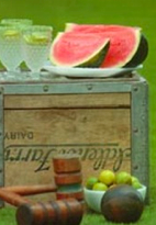
I am currently working with a darling bride to plan her early spring wedding next year. It’s taking place at a brand spankin’ new venue, Bridgeport Art Center. To say I’m IN LOVE with the space is a massive understatement – we already have two client weddings booked here.
The setting is gorgeous – raw but polished and warm. Exposed brick walls meet timber beams and soaring original skylights. Countless windows allow for unparalleled views of the skyline {a benefit of being in…well…Bridgeport!}
Here are a couple of images of the newly finished space:
{Obsessed with the natural runway/aisle!}
I am seriously loving the opportunity to play around with different styles and color palettes that would do a proper job of showcasing the beautiful backdrop of the venue.
Tomorrow, my darling bride and I begin the decor process and I have put together this inspiration board to use as a planning tool:
The bride loves the setting and wants to enhance it with a gorgeous palette of saffron/mango, rich ocean/teal, dusty greys and white. She loves vintage, eclectic touches, rustic but refined details and a warm and celebratory feeling.
Can’t wait to see how this continues to take shape!
{PS: Loving dreaming about what we’re going to do with the fabulous 80 passenger open-air freight elevator that takes guests up to the event space…a specialty bar and chandeliers will only be the start of it!}
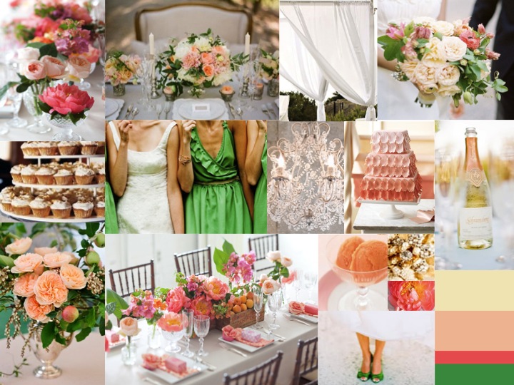
A favorite client of mine is having her wedding in a beautiful tented pavilion this summer. This bride has absolutely impeccable style and I am beyond thrilled to be working with her and her lovely family.
She initially came to me with a color pairing of emerald green + white (which you know I adore…so Kate Spade!) That said, there was a part of me that wanted to play around with ‘summertime’ a bit: take advantage of the bright, warm hues that are so seasonally inspiring…We swiftly came to a color story of peaches/apricots, coral/melon, creams and bright kelly greens.
She wants her design to feel a bit shabby chic, so we’re working with soft gauzy fabrics for the outdoor ceremony, eclectic vintage containers including cut crystal and milk glass to highlight guest tables and the inclusion of fresh summer fruits like peaches and apricots for added dimension and depth.
Attached is the inspiration board I put together for her day…Makes me shiver with anticipation of warmer temperatures and summer breezes!
My amazing cousin, Amy, is getting married today!! In her honour, I have put together a little inspiration board reflecting her simple, clean and romantic color story.
Amy has been a bridesmaid in what seems like dozens of weddings {so popular!} and has been first hand witness to loads of color palettes, wedding styles and overall designs – but from the day Chris presented her with the iconic ‘little blue box’, Amy knew she wanted her wedding to remind her of the minute he proposed.
A crisp, clean color palette of varied whites will be accented with the most subtle undertone of Tiffany blue and espresso. I’m hopeful the weather cooperates, as her charming ceremony is planned to be held outdoors at a country club, with dinner and dancing inside the clubhouse.
I have been lucky enough to be a bit involved with the planning/design process and just have to say that my cousin, Amy, is one of the most truly happy, appreciative and excited brides that I have ever had the pleasure of working with. I am so lucky to share her day with her!
{image credits} invitation suite by cheree berry, well dressed drinks by amy atlas, hair blossom by kmi photography via style me pretty, macarons by amy atlas, flowers on chair via wedding style guide, eaux-de-vie via martha stewart, peony bouquet from the dreamy liz banfield photography, happy saying by thebrightsideproject.com, balloon buffet by amy atlas, table number via martha stewart weddings
Some may recognize this board…I created it earlier this winter for my oldest and dearest friend, Caroline.
After over a year of long distance planning from San Francisco, Caroline and Gene became husband and wife this past weekend.
While the newlyweds are off on their honeymoon get-away…I’d love to share a few images of their stunning decor.
Caroline and Gene both appreciate design – Caroline is a landscape architect and her husband, Gene, is an architect. Caroline adores texture, depth and movement and appreciates interesting foliages accented with fluffy and bold blooms. We went with a color palette of 75% varied green tones, highlights of saturated melon hues and cool periwinkle tones.
The wedding ceremony and reception took place at the iconic University Club, a charming haven for relaxation, sophistication and socialization. Caroline’s family has been members for years – so the intimate Michigan Room became the setting for the love-filled nuptials and celebration.
The bride carried a gorgeous, textural clutch-style bouquet designed with white and dusty grey hues. Elements included peonies {in varied stages of development}, lisianthus {with their cutie undeveloped buds}, sweet pea {in honour of a nickname her mama used to call her}, fragrant lilac, grey brunia berries, velvety lambs ear and dusty miller foliages. The bridesmaids carried striking coral/melon peonies accented with unexpected grey dusty miller and plum colored cotinus foliages. {see image below}
Because the ceremony and reception took place in the same room, the catering staff and my Botanicals staff had to ‘turn’ the room. We wanted a different feeling for the ceremony and reception, so we decided to keep the ceremony simple and romantic. We closed the heavy drapes along the east and south walls and created an aisle framed by a pathway of flickering candlelight. A pair of rich wooden columns hosted graphic white lacquered vases topped with verdant fern plants to simply flank the couple. Finally, we always ribbon off the last row of chairs to encourage guests to be seated down the sides. The ribbon is untied before the processional for added drama. {see images below}
Guests exited the Michigan Room after the special and unique ceremony and made their way past the place card table to the Presidents Bar for wine and cocktails.
The place card table hosted a collection of varied vases and apothecary jars – each hosting different elements…some showcasing bold arrangements, other elements contained within the walls of the jars like terrariums. Richly colored plums and grapes were used for a beautiful visual and textural contrast against the varied green and melon tones. Finally, we provided four shallow white lacquered boxes hosting a tailored bed of fresh mosses upon which guests’ seating assignments were displayed. {see images below}
When guests’ re-entered the Michigan Room, we unveiled a stunning urban backdrop of Millennium Park by opening the Clubs’ existing curtains. Guest tables were dressed in crisp white pintuck linens, pre-set with the Clubs’ crested charger plates {a wonderful benefit of a private club!} and accented with crisp apple green bengaline napkins.
We created two centerpiece designs: A single white urn hosting a full, lush and crazy textural collection of varied foliages including meandering jasmine vine, feathery maidenhair fern fronds, oregon ferns, broadleaf geranium foliage, grey dusty miller and plum colored cotinus {I’m a total foliage snob and was obsessed with the selections!} Gently punctuating the rich foliage base were coral/melon peonies, fluffy viburnum, melon godetia {super cost effective bloom!}, green spider mums, lotus pods, succulents, seed pods and periwinkle scabiosa. Rich plums and tumbling grapes finished the sizable arrangements.
The alternating guest tables featured a collection of pieces placed in the middle of the tables. A mid-sized white urn hosted a petite version of the other centerpieces. Extending the design further, our cutie miniature white urns hosted varied floral/foliage pairings.
It was important to Caroline and Gene that they got to share their dinner with the bridal party – but also wanted to make sure there was room for dates/spouses. We lined 3, 8′ long rectangular tables end to end to create a grand setting. Guests were seated all around to add to the intimate feeling.
A long shallow and narrow box {measuring 12′ long!} was positioned in the center. Varied glass cylinder vases were either used to display the bridal party flowers or were swirled internally with artful fern fronds and topped with floating candles. The exaggerated box housed a little landscaped world of foliages and flowers used throughout the event.
Caroline and Gene shared their special day with just over 100 guests. The day was tailored to fit the the two of them – from start to finish. A day filled with love and emotion, style and beauty. A day to inspire them for the rest of their lives.
{Special thanks to: my wonderful Botanicals team – who pulled everything together while I was busy0 getting my hair and make-up done, to Lisa Zimbler Events for her day-of assistance, to the University Club for providing the wonderful setting for the day.}
Peonies are in season! I yearn for this time each year. While we are in transition with many spring blooms as they start to become less and less available…we wholeheartedly welcome The Peony.
Like many, peonies are one of my most adored flowers. They are romantic, they are gardeny, they are classic and sophisticated.
I just couldn’t pass up these vibrant raspberry sorbet colored peonies {pictured}…Ten stems have proven the perfect pick-me-up. A vintage trophy urn sits next to my bed hosting a handful of ruffly stems, accented with their natural foliage…what a wonderful way to drift to dream and later awake! A single stem used on my vanity adds charm for no one but me (my husband could care less!), and a tiny bud vase hosted one bloom on my desk that grew to the size of a melon!
Peonies can be used en masse for a bountiful, ruffly look or can be used mixed with other seasonal flowers like hydrangea, ranunculus and sweetpea for a remarkably textural look.
Versatile peonies are a wonderful selection for bouquets, for large focal arrangements, used singly floating in a beautiful dish, or used in centerpieces.
Brides beware – while many claim that most flowers are available year round – peonies are not one of them. Choose your wedding date wisely, lovelies, as I have had many clients disappointed with the news that we can’t create a peony-laden féte in early September! While in Chicago, peonies start to become available in the winter, the variety availability is quite limited, the quality is often disappointing and the prices are hefty. May and June (especially late May and early June) are wonderful months for the best and most voluminous blooms, for the best prices (although never a bargain, I fear) and for the most inspiring color and variety selections.
I find inspiration in so much…I initially started to gather images and ideas that were inspiring to me as a way to relax and re-energize myself. Then, after noticing I had quite the portfolio of collected images, I started creating inspiration boards for a few clients here and there, in an effort to help relay my vision for them. They are a helpful way to make sure we’re heading in the right direction together and that I truly am capturing the essence of what the bride is looking for.
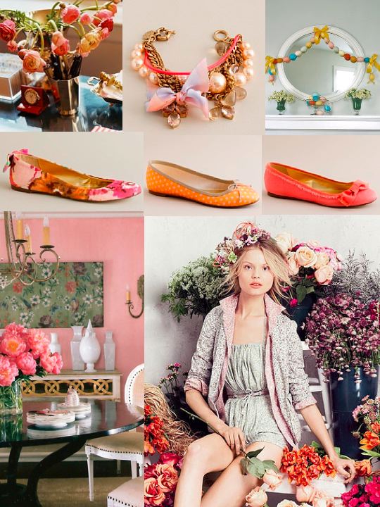
From there, I found that putting together inspiration/story/mood boards for other things in my life proved to be just as useful. Here are a couple of boards that I’ve put together recently for interior design projects I’m working on.
You won’t necessarily find any of the showcased items in the finished projects – these boards simply help tell the story, visually.
Inspiration boards certainly do not need to be put together for a bride or a client. I have found that designing inspiration boards are a therapeutic way to escape and lose myself in something that I quite simply…find lovely. Give one a shot (and if you’re inspired – send it to me and tell me why!)
One of my oldest, most special friends is getting married this summer. As her matron of honour, I’ve got plenty to say and plenty to be inspired about! I am so excited that Caroline and her family have enlisted my help with some of the details…
Caroline and Gene live in dreamy San Francisco and are planning their Chicago wedding mostly from afar. Both the ceremony and reception will take place at the iconic University Club…Where Caroline’s family has been members for years.
After a few phone calls and a handful of emails – I was able to nail the happy couple down over the holidays to really talk design. I presented them with a quick inspiration board – put together based upon the unique (and fabulous) color palette and the essence that Caroline conveyed to me.
Caroline is hoping for a color palette of 75% varied greens (ranging from bold citron tones to earthy mossy hues), accented with touches of vibrant melon and periwinkle. The bride is a landscape architect and adores varied textures and interesting, unexpected (almost quirky!) elements – from funky foliages to bountiful blooms. The groom is an architect, himself – and so the couple certainly has an eye for color, proportion and design!
Here is the board I put together – also deciding to add crisp, graphic white as a mod backdrop for the collection of colors….
Caroline and Gene are so perfectly suited for one another…I am yet again inspired by the power of love – and how it so captures pairings that are truly meant to be. I am thrilled to be a part of her planning process and am excited for whats to come…Stay tuned!
I had a lovely meeting today with one of my favorite old friends, Samantha, who is getting married this April. Today I presented Sam’s proposed wedding design and walked her and her sister through all of the details that I envisioned for her day.
After our initial meeting weeks ago, I was inspired to create a wedding design based upon Sam’s vision and direction, while also seriously considering her future husband, George’s, fairly different take on design.
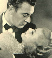
Sam was inspired by a fantastic black and white photograph of her grandparents, taken years ago. The photo had a simple elegance about it…It had a slightly glamorous feel, yet still felt modest. The image radiated love and companionship.
Sam had a title for her wedding, Modern Romance. She wanted it to have a classic and warm feeling, without feeling ‘expected’ or ‘cookie-cutter’. Her chosen color palette of red and white evolved slightly over the last few weeks to a focus on classic whites for the ceremony, shifting to a saturated, rich, monochromatic collection of bold reds, cranberries, crimson and claret for the reception.
Now, George had a slightly different vision for the wedding design…He and his grandmother used to love the original movie, Dracula, and therefore liked the idea of incorporating some Gothic touches here and there.
I quickly put together this inspiration board for the couple…One that captured Sam’s vision and taste while also incorporating a bit of George’s vision (perhaps even more than Sam expected!)
I see Sam and George’s wedding as a sophisticated soiree, laden with romantic, glamorous touches and unexpected ornate black accents. Featured flowers in the tailored creations will include numerous varieties of velvety red roses, miniature calla lilies and cascading hanging amaranthus. With our graphic ornate black risers and compote bowls, vintage black glass votive cups, billowing fabrics and warm candlelight-inspired lighting scheme, Samantha and George’s wedding will be the perfect balance of glamour and elegance…A wonderful way to start a life together.