I simply can’t get enough of the new(ish) online magazine, Lonny (London & New York).
After the absolute heartbreak that followed the closing of many design publications {domino, sniff sniff, at the top of the list} Michelle Adams {previously editor at domino, as well as owner of cutie rubie green} and Patrick Cline {dreamy photographer extraordinaire} decided to take on an inspired, daunting project.
Enter Lonny.
In editor and chief, Michelle’s, words:
OUR MISSION is to reopen the doors of accessible design. By embracing an online platform we provide inspiration at the click of a finger, directly connecting our readers to their favorite products and resources. Our freedom from page limits means that we can share more content in each issue, delivering an intimate look into the way people really live.
At Lonny, we value independent thinking and believe not in following trends but rather in making choices that lead to happiness. We believe that good design and affordable design can coexist and that true inspiration can be found in the teeniest of homes or in the grandest of spaces.
The amazingly talented {and sleep deprived} Lonny team has done a remarkable job of staying true to their vision thus far. With this issue, specifically, I can’t help but wonder…Was it written and created specifically for moi? {I’m sure every girl thought the same thing! Congrats again, Lonny!} With features of French hotels, kate spade and J.Crew, this issue simply makes me drool.
Here are just a few of my favorite photos and features from their second {current} issue:
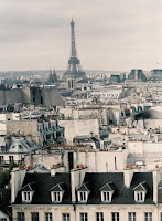
The charming and fantastically styled Parisian Hotel Keppler reminds us that people are traveling differently these days. Searching for stays that are reminiscent of gorgeous homes with special touches and loads of personal attention, people are seeking out boutique hotels as opposed to the monster compounds that many name-brand hoteliers have previously created.
The 1900s building was turned into a hotel after the second world war and redesigned by Pierre-Yves Rochon in 1997. The fabulous location is nestled in the heart of Paris, a few steps away from Champs Élysées.
 A simple black and white color palette is accented with pops of color to distinguish rooms from one another. I adore the layered textures and patterns showcased in every room. {A look that is here to stay also in wedding design…}
The Hotel Keppler is a fresh and current hotel that welcomes a juxtaposition of classic style with modern touches.

Here, a few page spread highlighted the recently revamped kate spade new york 5th Avenue flagship store. True to form with loads of kate’isms, the store is beautiful. {I have to note that I am equally as proud of our local kate spade boutique on Oak Street {my hoped-for second home} for being dressed just as beautifully!}
And although it seems I could truly re-highlight all of the gorgeousness found on the ‘pages’ of Lonny’s 175 page issue, I will control myself…
And so finally, another feature of a beautiful store. This time J.Crew Collection {in Manhattan, next door to YET another favorite – Lilly Pulitzer} is elegantly represented. The look of this boutique is virtually driven single-handedly by the style maven and creative director for J.Crew, Jenna Lyons.
I am obsessed with the nondescript door with “the stores name and address whispered gracefully in gold cursive”. The boutique is decorated in stylish vignettes, worlds apart from the cold steel racks of large department stores. The absolutely gorgeous black and white bathroom is a direct copy of Lyons own powder room.
Michelle, Patrick and the rest of the Lonny Crew – we thank you from the bottom of our hearts. Keep up the inspired, hard work.
{image credits} all images taken from lonny magazine, shot by patrick cline


